"Sometimes the sophisticated thing is easier to understand
than the kludgey thing. The flipped plots in the books were
driving me crazy. They don't even pass the dimensional analysis
test."
 -- John Denker
I have been known to rant occasionally about some of the curriculum choices we have made for high school mathematics. I feel the math we teach should be useful or interesting, and ideally both. But it should also be true! I think of that as the teacher’s equivalent of medical rule: first, do no harm.
What brings this to mind is an email discussion I have been having with Dr. John Denker, a physicist who I have “met” through the Phys-L.org email list. He has, as you see above, some very reasonable objections to the way that my book repeatedly points out the symmetry between the graph of a function and its inverse. I would like to discuss his objections here in this post and also to show his suggested alternative. Then, in the spirit of this blog, our email discussion led me to remember a nice method for using graphs to evaluate iterated functions. I will write about that in another post soon.
[By the way, to any current or future physics teachers out there: I strongly recommend joining the email list Phys-L. It may be the single most helpful resource I know of, populated by many patient and enthusiastic experts, including Dr. Denker. My current students can attest to the many occasions when my teaching has been assisted and influenced by ideas I encountered on Phys-L.]
OK, on to those flipping graphs…
CLAIM: If you graph a function and its inverse on the same axes, the two graphs will have an interesting and esthetically pleasing symmetry with respect to the line y = x.
I am by no means the only one who makes this claim! Search the web for “inverse function graph symmetry” and you will find that claim stated quite frequently.
For example, consider the squaring function, with its domain restricted to the non-negative real numbers. It has an inverse function, the square root function, and sure enough, if you graph both functions on the same axes, you see the symmetry that I am talking about:
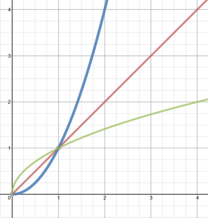
The graph above was made at www.desmos.com, a very user-friendly graphing site. And the graph certainly provides evidence in favor of the claim. And I personally find this to be, as I said, esthetically pleasing. Also, this idea is not without application. When you learn a formula for finding derivatives of inverse functions, this symmetry will present a graphical way to understand that formula. Still, if I had to guess, I suspect that most of the people who write about this claim do it because they like how the graphs look. They look nice.
OBJECTION #1
“If you graph a function and its inverse…” But why would you ever do that? As JD pointed out to me:
I don't think anybody ever needs to flip the axis to form
the inverse function. Just read the axes in the other order.
That’s a good point. For example, let’s look again at the squaring function by itself this time.
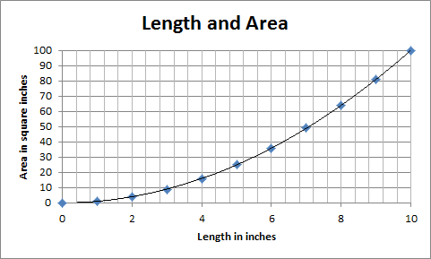
The graph is a convenient way to represent the relationship between the length of the side of a square and its corresponding area. But if you already knew the area and wanted the length, you would not need to draw a new graph! You would just need to know how to read the graph you already have! You’d start on the vertical, area axis, go over to the curve and then read down to the horizontal axis where you would read the length. Same graph, different purpose.
BUT STILL…
OK, I don’t need to graph the inverse function. But what if I just want to because I like how it looks. Is it wrong? Does it violate the teacher’s version of the Hippocratic Oath? Alas, not always, but often, and in a way that I should have considered, seeing as a major theme in my book is how math is actually used in science. My current students may find it amusing that what I have overlooked are the units! I may feel like graphing the two functions ON THE SAME AXES, but in most cases, it would be wrong. Which brings us to…
OBJECTION #2
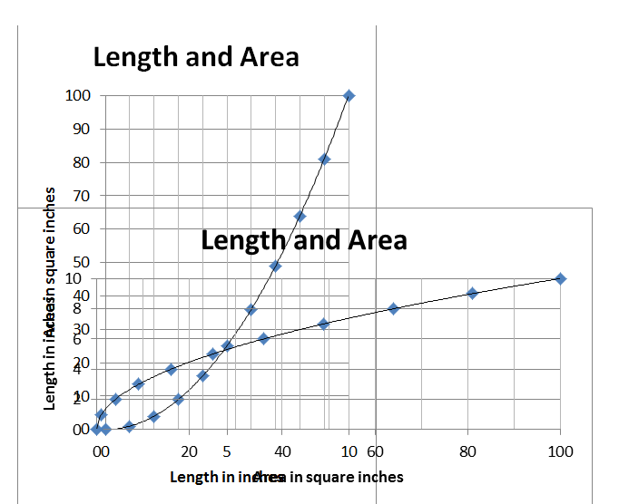
The flipped graphs do not have the right units on each axis!
You don’t need to use sophisticated physics or chemistry to show this. Our first graph above with the squaring function and the square root function illustrates the problem sufficiently. Look again at the vertical axis. Pick a number. OK, 2. But 2 WHAT? Is it inches or square inches? Meters or square meters? D’oh.
The bottom line is that if your functions represent physical quantities, then those quantities have units. And unless the units happen to be the same, then you cannot just flip the graph. You have to flip the axes as well. You just can’t throw those graphs on the same axes. Look at them side-by-side:

If you want to show the symmetry of the original claim, you could take these two graphs, put them on overhead transparencies and lay one on top of the other:
It’s not as pretty, but at least its not wrong.
When you are focusing on the math, it is easy to forget that these quantities have physical meaning and units that go with them. For example, there are many books and websites where you can see a function and its derivative graphed on the same axes. (It’s even done that way on some of the websites that I used in earlier posts about derivatives.) But that makes no sense! For example, how can you graph position and velocity on the same axes? They don’t have the same units.
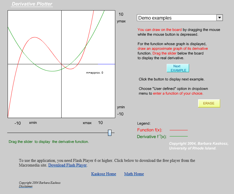
I did a quick web search for “function derivative graph applet”. Here is one site (of many) I found that puts the function and derivative on the same axes:
http://www.math.uri.edu/~bkaskosz/flashmo/derplot/
Here’s one that correctly puts them on different axes:
http://www.flashandmath.com/advanced/derdraw/DerivativeDraw.html

These are both very clever websites, good for developing a feel for what a function’s derivative looks like. But the second one is better — it remembers that these are quantities with units. (Also, the shading on the derivative graph is a neat bit of fore-shadowing. That’s a topic for another upcoming post as well.)
Getting back to the Flipping Graphs…
If you don’t like the looks of the two overlaid transparencies, there are some other ways to visualize these functions and their inverses. John Denker presents a few of them on his website here:
https://www.av8n.com/physics/math-intro.htm#ex-graphs
Here is one diagram (figure 10) from his site that I especially liked:
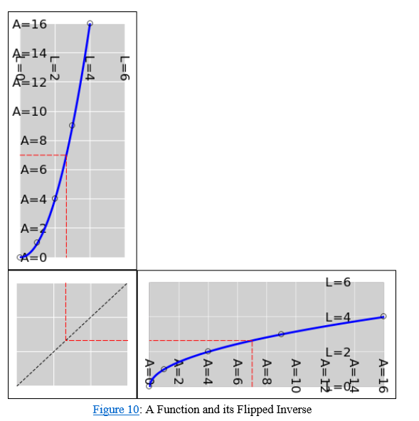
The “reflector panel” reminded me of another clever method of interpreting graphs. More on that in a future post…